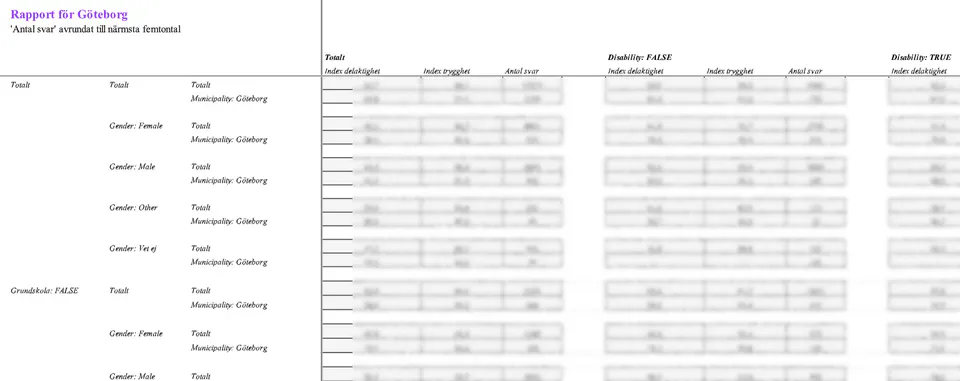
I find myself curious about nearly everything – and sometimes that expresses itself as trying to understand data, and structuring streams of data to turn it into useful information. Here are some examples I can share.
As part of their commitment to knowledge-based development of youth work policy and practice, KEKS has developed a web-based system for documentation and follow-up called The Logbook. This platform is used to collect statistics and conduct surveys with young people. In 2024 alone, 119,772 activities were registered in the system, and more than 13,000 young people responded to the surveys. This generates a substantial amount of data, enabling local youth workers to develop their practice in a data-driven way, and allowing KEKS to present evidence-based reports on outcomes and engage in informed advocacy at the local and national level. However, The Logbook only reports summary statistics on responses, with no detailed breakdown by background factors. For more detailed analysis – such as examining subgroup responses or identifying correlations between questions – external expertise is needed, which I’ve been providing over the past several years. Participation leads to learning – a central insight for KEKS, and easily seen in the data. One particularly interesting analysis I did recently was of how demographic background variables, such as age and gender, affect outcome variables like perceived safety. Until now, this question had only been assessed by a simple pairwise comparison of the means – so, for example, the mean perceived safety among visitors with parents born outside of Sweden is higher than in the other group – but a regression analysis revealed that, controlling for age, gender, and having passing school grades, ethnicity is not a significant variable. These analyses contributed to the forthcoming report “The Youth Centre: Myth and Reality”, which will be available online in May 2025.
It might not be the most obvious thing to include on a list of projects - after all, most people just handle this kind of thing with a Google Form. I, however, had some ideas about gathering social network data for arranging seating, as a fun little application of the kind of thing I did in the PhD. That, of course, is not possible with just a Google Form. So it turned into an interesting challenge of figuring out web hosting, how Cloudflare works, and most importantly how to use AI to write an entire project in a programming language I don’t speak - the entire thing is in TypeScript, which you certainly don’t learn in a maths PhD. The fact that this was possible is, I think, a sign of the general usefulness of one of the more underappreciated skills mathematics teaches you: Black-boxing everything you don’t understand and still creating a working new thing. Using a theorem from a paper you never read isn’t that much different from using AI to write code where you only understand the big picture, not the details. The page is running as a demo version here, and the code is available on GitHub.
A constant problem in most scientists’ lives is keeping up with interesting new papers in their area. One classic “solution” to this is the arXiv digest emails – every morning, you get an email with a list of the titles and abstracts of all the papers published in the areas of your choice. Of course, of these, maybe one or two is interesting, so you end up spending a lot of time sifting through papers that are utterly irrelevant to you. Then, for the ones that were interesting, you try to keep track of them to read them “some day” – and all too often your system for that is just an endless list of open tabs you will get to “some day”. This project offers an improved solution to both these problems. Instead of getting the arXiv email, you can directly import all those papers into a Notion database, where you can then sort them according to tags, projects, or any other system of yout choice, with no risk of losing them all because Chrome crashed. It also offers a simple AI recommender algorithm that attempts to sort the papers by how similar they are to things you have found interesting in the past, automating away some of the first sifting of the data. There are still some more features I would like to add to this: I want to improve the recommender algorithm for it, and create a simple way to set this up to run automatically in the cloud for you, instead of having to manually trigger it each morning. Finally, using the stored embeddings of the papers for a RAG model, to enable chat about the stored papers, would be very interesting.
For the 2024 European Parliament elections, SVT, the Swedish public broadcasting corporation, surveyed all candidates from the established parties on a range of key political issues in that election. Based on their responses, SVT created a simple quiz to help voters find the candidates whose views best match their own. However, the tool has some significant limitations. It doesn’t allow filtering by specific issues – so, for example, if you strongly support aid to Ukraine, the quiz might still recommend candidates who oppose it, simply because they align with you on other topics. It also lacks any kind of visualisation or summary of the overall data, offering no broader view of the political landscape. To address this, I collected the full dataset from SVT’s site and created a visualisation. The plot’s axes represent the first two principal components of the data, which align closely with a common-sense understanding of where Sweden’s political parties stand – hence the labels assigned to them.
How do support vector machines work, anyway? This little page gives an interactive way to explore this question, by applying different kernels to a synthetic data set, along with some theory to explain what is going on. This was originally an assignment in a course on machine learning, but I went above and beyond to provide this interactive visualisation instead of just writing a static report on it. The full code behind the project is available in this GitHub repository.