Swedish candidates for the European Parliament
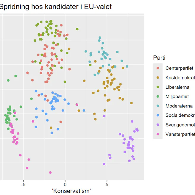
For the 2024 European Parliament elections, SVT, the Swedish public broadcasting corporation, surveyed all candidates from the established parties on a range of key political issues in that election. Based on their responses, SVT created a simple quiz to help voters find the candidates whose views best match their own. However, the tool has some significant limitations. It doesn’t allow filtering by specific issues – so, for example, if you strongly support aid to Ukraine, the quiz might still recommend candidates who oppose it, simply because they align with you on other topics. It also lacks any kind of visualisation or summary of the overall data, offering no broader view of the political landscape. To address this, I collected the full dataset from SVT’s site and created a visualisation. The plot’s axes represent the first two principal components of the data, which align closely with a common-sense understanding of where Sweden’s political parties stand – hence the labels assigned to them.
Jun 8, 2024
SCBHandlerPlotter, plotting public statistics on maps
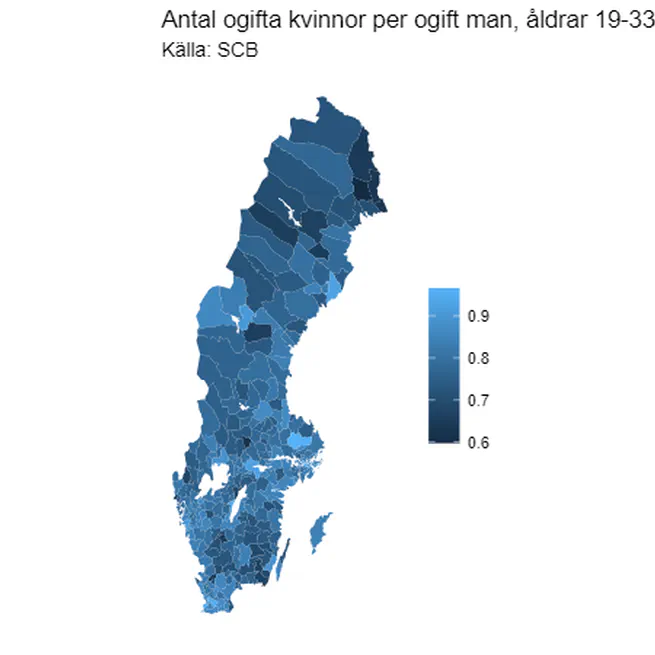
A little project to make it easier to explore some statistics provided by Statistics Sweden, the Swedish public statistics agency. It provides a handy syntax to grab data that does not require the user to remember which data is in which table, and a function for plotting this data on a map of the country. Here is one example of such a plot, showing the number of unmarried women per unmarried man in the age span 19-33. The data reveals the expected trends – the rate is highest in the university towns, while in the depopulating rural areas in the north, it is much lower. This is probably my most “mature” project code-wise, in terms of having properly set up unit tests with good coverage, and generally adhering to good coding practices.
Mar 24, 2021